Experiments 2 - 4: analysis
See experiments 2 3 4 - knowledge visualisation
Early experiments: 2-3
These were early experiments, before I had really thought through what I was testing, and it shows - for example:
- Collection 2 had 420 resources in it: when I tried feeding all the notes into ChatGPT manually to create the "AllNotes" version of the collection, ChatGPT told me it was too long; chances are the S-0 summaries were too.
- I only use Summariser 0
Nevertheless, I'm analysing here their results to better design experiment 4.
Experiment 2
The single most used tag in the collection was psychology (68 resources), yet this was not mentioned as a theme or subtheme. This may be because there was too much content for ChatGPT to consume, of course.
What of the Experiment 2 mindmap: c-2-s-0-response-p2-mindmap.jpeg?
!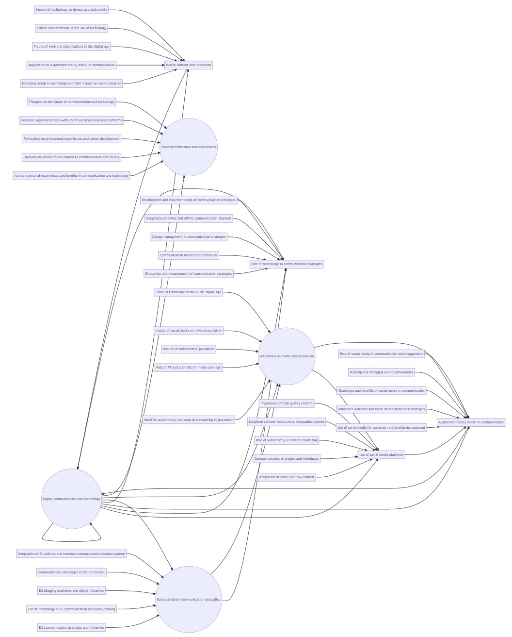
While ChatGPT identified 8 toplevel themes, the mindmap only displays 4. Not good!
Experiment 3
Did we do better with a collection of only 10 resources?
Even with only 10 resources, it's a lot of work for me to evaluate the appropriateness of all 6 themes and 27 subthemes ChatGPT found within them (see c-3_s-0-response-p-2. At first glance the 6 themes look right, but a moment's thought and research reveals:
- themes like "The brain's decision-making processes and susceptibility to misinformation" and "The importance of understanding cognitive biases and psychological factors in information processing" are pretty much saying the same thing
- for the subtheme "Predictive coding and interpretation of sensory information", only one item in the collection mentioned "Predictive coding", and none of them mentioned "interpretation of sensory information"
- for the subtheme "Reconstruction of memories and misattribution of information" I found no mention of "Reconstruction", although I found one (again, just one) mention of "misattribution"
Moreover, when I asked it to identify subthemes which appear in more than one theme, it started making things up: the subtheme "Impact of media literacy education and fact-checking efforts" does not appear in the theme of "the need for effective communication, dialogue, and understanding in addressing misinformation and promoting accurate information", simply because that theme does not exist.
The mindmap c-3-s-0-response-p2-mindmap.png on the other hand, is a lot better than in Experiment 2:
!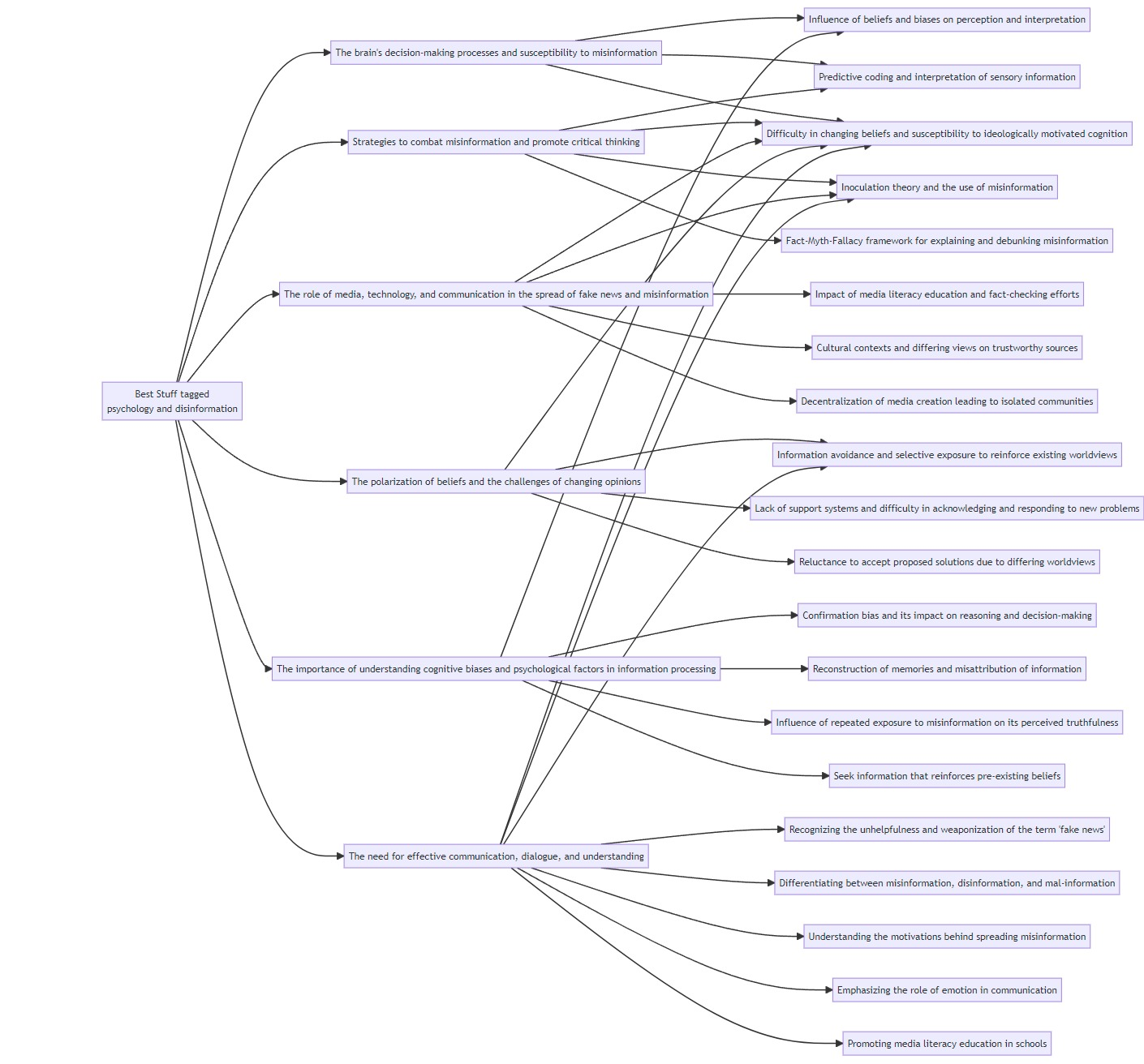
All top-level themes are present and it's easier to read. But some subthemes are missing:
- The use of explicit warnings and counterarguments to inoculate against misinformation
- Exposing individuals to a little bit of science denial to counter science denial
- Discrepancy between elite media commentators and grassroots groups/independent media outlets
- Distracting focus from systemic threats and the problem of "fake news"
- Finding ways to discuss politically polarizing information without challenging worldviews or forcing action
- Debunking the myth of online echo chambers
- Changing buttons from "like" to "agree," "disagree," "suspect," and "trust"
Remark: 5 of these 7 subthemes were the last subtheme listed under their theme.
Also, while ChatGPT identified "Difficulty in changing beliefs and susceptibility to ideologically motivated cognition" as belonging in two themes, on the mindmap it appears to be linked to five - almost all of the 7 themes.
Summary
Using S-0 and Prompt 2, ChatGPT invented themes that were not there and ignored themes that were, and then misrepresented its (wrong) findings when visualising them.
Experiment 4 (underway)
Experiment 4 is an evolution of Experiments 2 & 3 in that the same collection and summariser was used, and one of the end goals is a visualisation of a Collection's main themes.
New goal
However, I'm aiming for a different goal, reflecting the problems discovered earlier:
- Hallucinations
- In all experiments, ChatGPT hallucinates credibly - while it makes stuff up, it's believable stuff.
- Moreover, the hallucinations took some finding: I had to dig back into the original texts to spot where it made stuff up
- If Charts can lie, ChatGPT visualisations are magician-level misleading
- Visualisations (almost) always generate a "Wow" factor, and hide the data behind it. This can blind the user to problems in data or presentation method
- So while ChatGPT's hallucinations are a major problem at any time, they're doubly so when they generate visualisations
- As is so often the case with knowledge visualisations, the initial Wow I got from viewing the vislualisations in Experiments 2 & 3 was followed by a "So What?". What use are they, particularly when you have to double check everything for hallucinations?
- And while on the subject, what use are they even if they don't hallucinate? After all, a min dmap's centralised focus shows a central node connecting to themes, which connected to subthemes. The resources are not actually shown.
So rather than trying to get an accurate visualisation of a Collection, I'm now more interested in getting a provocative one - something that will make me think by spotting potential new connections, even if those connections were not themselves present in the collection.
For this, a different mindmap is required, showing both the articles and the themes.
Prompt2b
Hence prompt 2b - themes visualised. However:
- I fed precisely the same prompt and collection to ChatGPT and got two completely different responses - see the themes identified by ChatGPT in c-3_allnotes-response-p-2b-1 and c-3_allnotes-response-p-2b-2
- Moreover, Mermaid doesnt seem able to create a concept map which is not a centralised mindmap.
Prompt2c for a new visualisation engine
So I turned to a new mapping tool (Graphviz) and its test neato visualisation, and a new prompt (prompt 2c - themes and resources visualised) to take advantage of it.
Prompt2c - version 1: learning graphviz
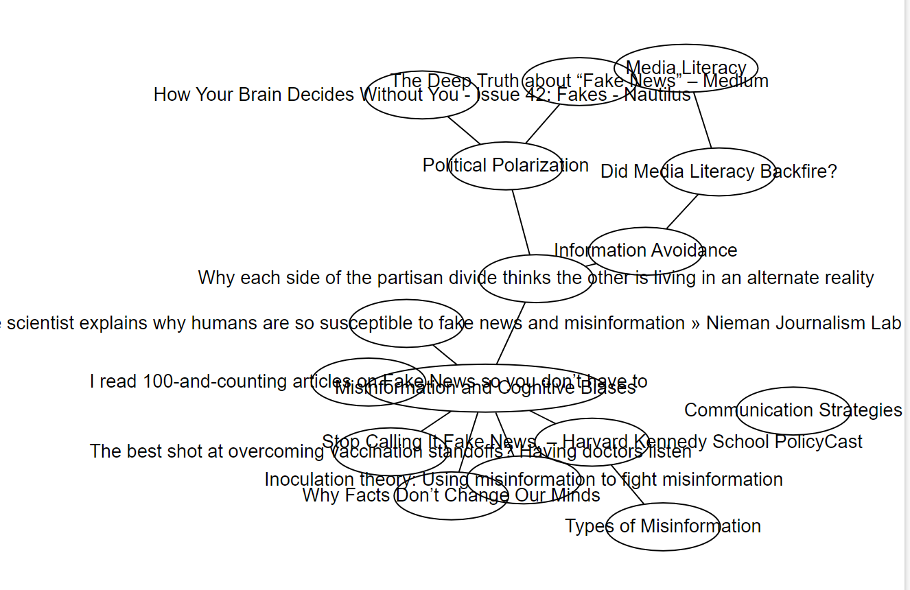
In c-3_allnotes-response-p-2c I tried to get a useful visualisation of the same content (c-3_allnotes) using Graphviz. The result wasn't great to say the least (c-3_allnotes-response-p-2c-1.png):
!
The conversation therefore continued as I tried tweaking node size, shape and colour; introduced line breaks into the texts so they'd fit inside the nodes; and tried to make the whole thing more compact.
Near the end I made the most progress by simply telling ChatGPT what I wanted, but the struggles beforehand taught me a lot about Graphviz. It will be interesting to see whether in the future I'll simply default to "ask ChatGPT" without all that the struggle... and learning.
Eventually I had something (c-3_allnotes-response-p-2c-12.png) that I can actually make sense of:
!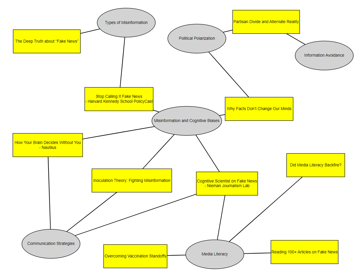
So I asked my last question of the conversation: "compose a prompt combining these characteristics so that I can generate concept maps like this quicker".
Prompt2d: building on prompt 2c
I took that response, added in everything I learnt from c-3_allnotes-response-p-2c, and created prompt 2d - themes and resources visualised.
This I then tested using the same collection to create c-3_allnotes-response-p-2d, resulting in the c-3_allnotes-response-p-2d-1.jpeg concept map: 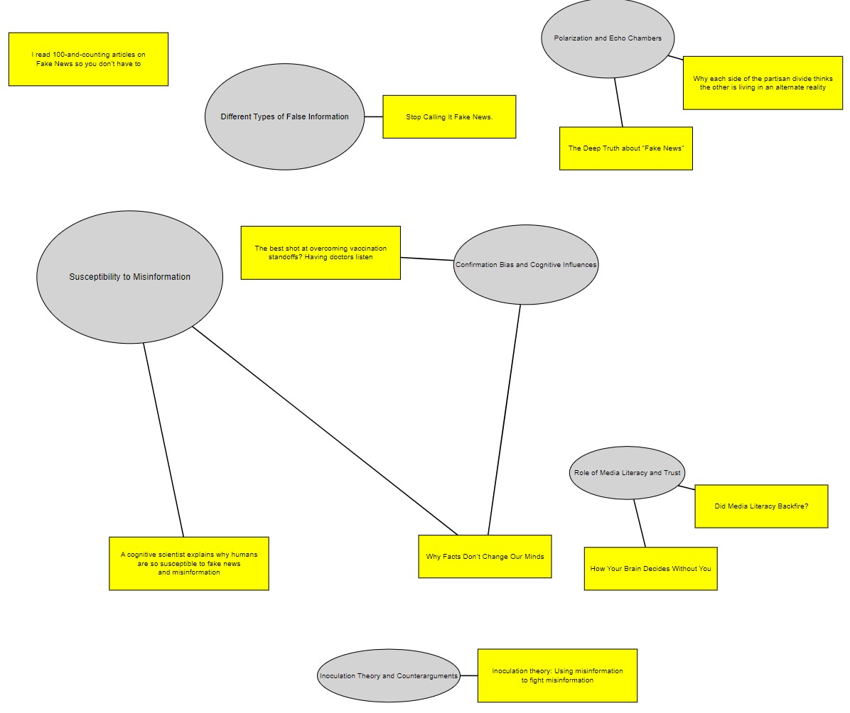 .
.
Different themes & interconnection density
Although the content analysed in the collection is identical and the prompts very similar, the resulting concept maps are very different, with far more interconnections in the concept map resulting from the earlier conversation (2c-12) than in (2d-1), when I tried to distil everything into a single prompt:
- in 2d-1, the average article is linked to 1 theme, while in 2c-12, the figure is 1.7, with one theme (Misinformation and Cognitive Biases) connected to 5 articles. Note that this theme is the one ChatGPT created at my request from two themes, but I did the same thing in 2d-1 (Confirmation Bias and Cognitive Influences), which is not more central than anything else in 2d-1.
- interesting edge case:
- in 2d-1 ChatGPT correctly placed the "100 articles on Fake news" article off to the side, disconnected, as my notes on it were almost empty ("A library, organised by topic") as it was my own post, which I tend to only describe, not annotate.
- in 2c-12, however, this article is linked to the Media Literacy theme.
One obvious possible reason for the difference in connection density is the difference in themes. The two experiments show - not for the first time - that when asked to identify themes in the same content, ChatGPT will identify different themes.
However it is also possible that the key driver here is the length of the conversations: 2c-12 was the result of an 18-response conversation as I wrestled with graphviz, whereas 2d-1 resulted from only 3 responses. It doesn't necessarily make sense - the content, after all, is the same - but ChatGPT often doesn't.
Abbreviated titles
Examining the graphs I noticed that 2c-12 has abbreviated resource titles. At a late stage of the conversation in c-3_allnotes-response-p-2c I asked it to "make the entire thing more compact", and I see now that ChatGPT turned "I read 100-and-counting articles on Fake News so you don’t have to" into "Reading 100+ Articles on Fake News".
This didn't happen in c-3_allnotes-response-p-2d, as the prompt didn't give ChatGPT much leeway, simply asking it to "Reduce node separation to make the concept map compact".
What's a useful question?
I find the figures constantly forcing me to ask questions like why is article X not connected to Theme Y, when article Z is? For example:
- in 2d-1: Why is How Your Brain Decides Without You not linked to Confirmation Bias and Cognitive Influences?
- in 2c-12: Why is Why facts dont change our minds not connected to Communication Strategies?
But these are not the best questions. They come from comparing just resource and theme titles, while the links themselves come from ChatGPT's underlying analysis of my notes rather than the full resource. Even without hallucinations, in other words, they're not that informative.
Rather than "is this correct", the question should be "what does that make me think of?" And there is a quantitative difference in the answers to that question between the 2 concept maps. 2d-1 is so sparse nothing interesting jumps out to grab my attention, whereas the centrality in 2c-12 of the Misinformation and Cognitive Biases theme (linked to 5 resources) seems to give me something to work with.
Interestingly, the first questions I found myself noting here are not about that theme, but about the themes "orbiting" it. I asked the following questions as follow ups on conversation c-3_allnotes-response-p-2c:
Communication Strategies theme
I asked: What do the 3 resources relevant to Communication Strategies say when developing a communication strategy to counter disinformation? Focus specifically on where they agree and disagree.
ChatGPT's initial answer seemed based purely on the titles - I had to remind it I had provided notes on each - but even then its ideas were rather insipid, so I didn't pursue it.
Media Literacy theme
I asked: OK let's look at the Media Literacy theme. Recalling the notes on the 4 resources provided earlier and your initial definition of the theme, develop the theme of "Media literacy" into an overview of these four articles linked to it, with a particular focus on how media literacy either helps cause and/or solves the issues set out in "vaccination standoffs".
The instruction to "recall the notes" seemed to work, so I followed up by asking it to "Use these insights to design a strategy aimed at doctors to help them better communicate with their patients who ask them about vaccine misinformation"
The result was a good starting point, so I asked for images for a poster for doctors waiting rooms in support of the strategy - see c-3_allnotes-response-p-2c-A-Visual_Posters_for_Vaccine_Strategy
From concept map to framework
I asked: How would you rearrange this picture - without changing the contents - so that it presents a framework for understanding political polarisation and misinformation? I want to see a clear "cause and effect" movement from left to right, showing how the different phenomena interact to give us the world we see today. Include and identify solutions in one part of the framework if relevant and available
I didn't really expect to get an insightful framework, particularly as the collection of resources ChatGPT was working from could not be described as complete. But I was interested in whether it could rearrange a concept map upon demand.
Answer: not without some trouble - as can be seen from the conversation, I had to tell it to connect disconnected nodes as well as add labels and debug it's attempt to add arrowheads, eventually generating c-3_allnotes-response-p-2c-B-frameworkmap5.jpeg:
!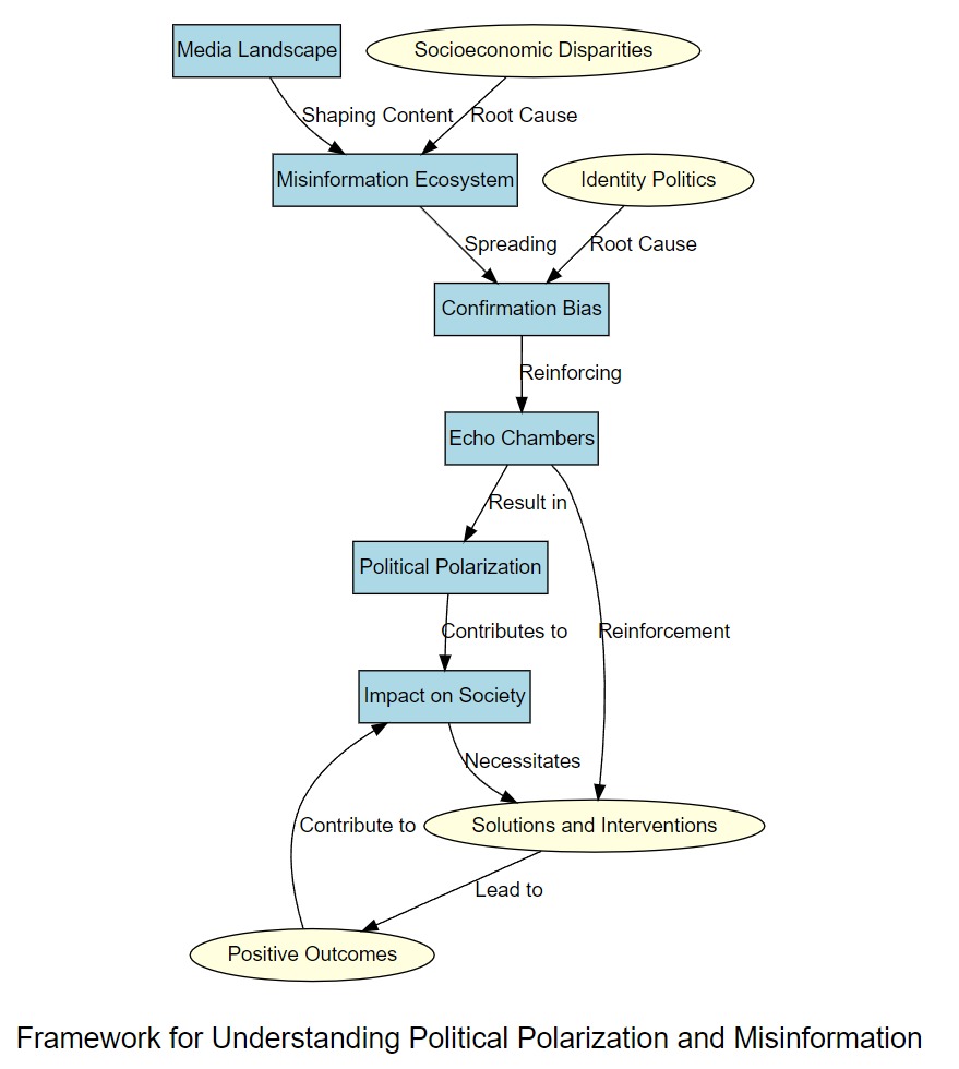
But while this process was laborious - I have to copy the code into graphviz, after all - I should be able to develop a prompt specific to "framework maps".
More importantly, it's now easy to imagine an app which generates the visualisations as responses integrated into the conversation. This is the essential promise of this sort of visualisation:
- you see at a glance how different concepts might relate to each other, according to ChatGPT
- having to correct ChatGPT is the entire point: it makes you think about it
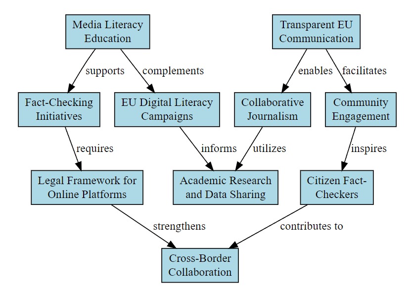
Combat misinformation about the EU
I asked it to suggest between 5 and 10 feasible ways the knowledge and ideas set out in the conversation could help combat misinformation about the European Union.
Why? I've written about this a lot in the past, so I thought this would make an interesting experiment - would I see anything I hadn't already thought of?
Not really. Some are pretty obvious (Transparent EU Communication), although some of them are not an EU competence (Media Literacy Education) while others were relegated to the "too hard" basket long ago (Community Engagement - something I've been arguing for, and piloting since 2002).
Others, moreover, could be counterproductive by furnishing evidence of the sort of EU "Ministry of Truth" and "Propaganda in Schools/Media/Civil Society" initiatives so beloved of conspiracy theorists (Fact-Checking Initiatives, Collaborative Journalism, Citizen Fact-Checkers, EU Digital Literacy Campaigns).
Perhaps the only ideas which still may hold some potential would be Academic Research and Data Sharing, Legal Framework for Online Platforms (ie, the DSA) and Cross-Border Collaboration.
Nevertheless I thought I'd try and combine what I've learnt so far:
- created prompt 2e - framework
- applied it to the above EU anti-Disinfo programme: see c-3_allnotes-response-p-2c-EU_Misinformation_Program_Model
- producing this:
!
This conversation, I suspect, could continue for a while, but this experiment has already produced enough food for thought.
Other ideas & next steps
This is a dumping ground where I add ideas as they occur. So in no particular order (for now at least):
- feedback from someone in a private chatroom:
- "there is a distinct data-scrubbing activity/stage for AI-mediated knowledge graph development ("knowledge cluster defuzzification"?). You may find a better name for this analytic prep work; but your results under "Concept stage" nicely illustrated the benefit of this "defuzzification scrub".
- these charts... are "over-flattened" (too unidimensional?) so that it becomes difficult to pickup significance. Adding "macro-data enchrichment" activities to your analysis (order by time, place, size or other significant macro-coordinate) should help new dimensions of meaning "pop out" a bit more for the casual reader of your visualizations."
- test prompt2d a few more times on different collections to see if it always generates low connection densities. If so, try and improve it so I get the density seen in 2c-12 from a single prompt
- continue both conversations based on the concept map artefact: how does a conversation between me and a visualisation look like?
- include tags in resource nodes, and/or one-line theme summaries in theme nodes?
- visit resource URLs and recalculate
- combine original resource content with my notes
- give my notes 4x weight
- generate your own tags, compare with mine, suggest missing
- check token limit
Revision Notes
This is one of this wiki's pages managed with the permanent versions pattern described in Two wiki authors and a blogger walk into a bar…
- changes:
- fixed inline images, file nomenclature
- version control
- this is version: current
- here is the current version: experiments 2 3 4 _ analysis
- previous version: experiments 2 3 4 _ analysis 1